Pantone’s Color of the Year: A Colourful Conspiracy?
Just like Miranda Priestly’s condescending tirade on the commercial significance of that cerulean sweater, it’s about this time every year I prepare for the incessant capitalist tirade that is the Pantone Color of the Year. I’ll admit from the get-go that I’m a self-proclaimed cynical designer, but instead of my usual knee-jerk disdain, let’s delve into the fiery pits of my scepticism – is Pantone’s Color of the Year a white-cat-stroking global marketing plot for the creatively bankrupt, or light-hearted and topical talking point for designers?
More Hype Than Insight?
Pantone’s annual colour pronouncement is met with cheers and jeers, but its legitimacy is murky. Chosen by a committee with close fashion industry ties, these “trends” often feel forced, raising questions about manipulation.
Their missteps extend beyond trend miscalculations. Social media critics rightfully pointed out the tone-deaf release of ‘Living Coral’ in 2019 amidst a flood of reports across the globe on ocean acidification and mounting sea plastic pollution. These incidents expose the dangers of reducing complex cultural narratives to colour swatches for profit. While not inherently malicious, Pantone’s methods reek of subjectivity and apparent manipulation for some sort of underlying purpose.
Ultimately, Pantone's Color of the Year feels less like a cultural barometer and more like a self-serving spectacle. It's a carefully crafted narrative designed to generate buzz and influence consumer choices, often with questionable results.
The OG Gatekeeper
Forget nuanced cultural insights, Pantone’s Color of the Year is a shameless marketing ploy, a carefully orchestrated PR stunt designed to set cash registers pinging. Let’s face it, the annual announcement ignites a media frenzy, with articles, interviews, and influencers all tripping over themselves to dissect the chosen hue. This buzz translates directly to sales – with Pantone’s own colour guides and branded merch flooding every corner of the internet to piles of fast-fashion garbage (more on that later).
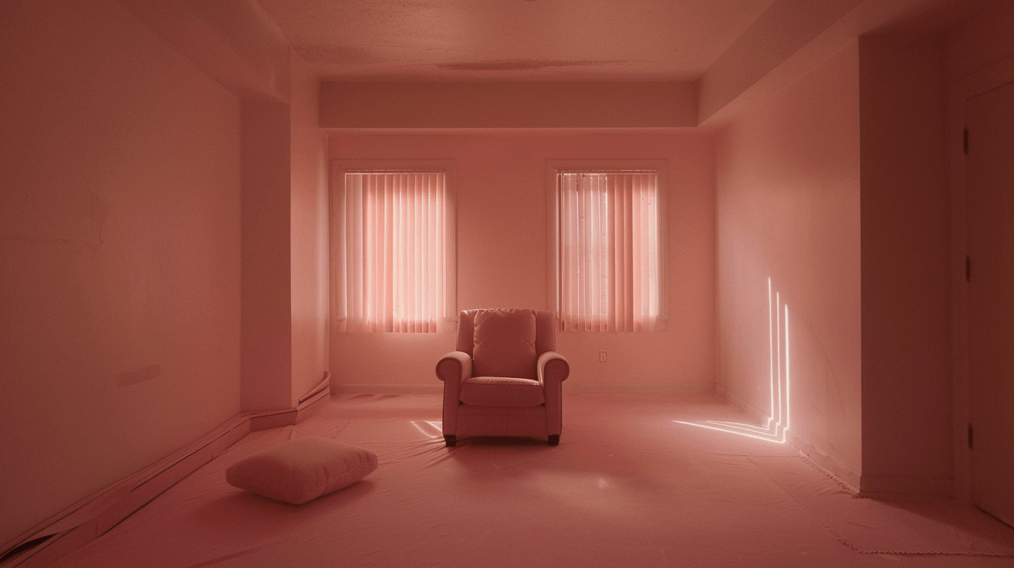
But this seemingly insignificant marketing ploy comes at a cost – figuratively and literally. Pantone’s colour systems and palettes are notoriously expensive, creating a financial barrier to entry for smaller designers and artists. With this year’s formula guide coming in at an eye-watering £188.40, exclusivity stifles creative diversity and reinforces the industry’s elitist tendencies. It’s like having a playground built for the privileged few, while the rest of us watch from behind a Peach Fuzz-hued fence.
Likewise, Pantone’s trendsetting often fuels the ever-insidious, ever-problematic monkey on all our backs: fast fashion. Each year’s colour becomes a fleeting must-have, pushing consumers to buy the newest, cutest most *aesthetique* creamy hues. I don’t need to ascend to further levels of soap-boxery, but suffice it to say, this constant churn reflects a completely, tone-deaf disregard for sustainability and mindful consumption while still trying to stay woke (I’m looking at you, 2017 Color of the Year ‘Greenery’…)
The Tiktok-spiracy
While the exorbitant price tag of Pantone products might exclude smaller designers and artists from embracing the “trendsetting” hues, the bigger picture reveals a more concerning issue. Pantone’s Color of the Year, beyond its financial inaccessibility, is facing accusations of manipulating trends and aligning with corporate interests. Forget democratizing colour palettes, some suspect a carefully orchestrated dance with tech giants and fast fashion brands, where the chosen shades aren’t cultural barometers, but marketing campaigns in disguise.
Staff writer at Hyperallergic penned a particularly telling feature (‘The Pantone Color of the Year “Conspiracy,” Explained’ https://hyperallergic.com/861738/the-pantone-color-of-the-year-conspiracy-explained/) exploring how TikTok sleuths are sniffing out a conspiracy, alleging the chosen hues aren’t just trendsetting, but subliminal messaging pumped down from our tech overlords. Let’s look at PCOTY 2017 Greenery again… coincidentally aligning with Android’s lime-green text bubble release? Users suspect Pantone isn’t picking colours, they’re picking pockets – partnering with tech giants to influence trends and line their own. From Delta’s “Ultra Violet” uniforms to Airbnb’s “Living Coral” vibes, the evidence seems, well, colourful.
But is it merely coincidence, or a carefully orchestrated colour caper? Pantone claims their process is pure, a "flowing conversation" by "color-attuned" folks.
However, secretive meetings and pre-existing partnerships with phone companies and fabric manufacturers paint a different picture. Is the Color of the Year less about reflecting the zeitgeist and more about influencing it?
So, what’s the verdict? Is Pantone’s Color of the Year a benign trendsetter or a manipulative marketing machine? Let’s just say the jury’s out, and this cynic isn’t holding my breath for a balanced decision.
While it sparks dialogues, ignites creative fires, and even unites us in shared amusement (or disdain), the glitter hides some worrying cracks. From questionable legitimacy and accessibility issues to fueling fast fashion and potentially playing puppet master with cultural narratives, Pantone’s pronouncements leave much to be desired.
Perhaps it’s time we approach trends with a more critical eye, celebrating the kaleidoscope of colour experiences in the world beyond their singular, often questionable pronouncements. After all, the world deserves more than just another year of the “it” shade dictated by whispers of corporate influence and veiled motives. Let’s keep the colours vibrant, the discussions lively, and the cynicism, well, appropriately sceptical.

