Partnership
Engine came to us with a challenge shared by many growing tech brands: clarity.
They had the products, the innovation, and the ambition but needed a unified brand system to bring it all together.
Our goal was to create an identity that could flex across multiple “engines”, from data and policy to education and AI, while maintaining a single, credible brand presence.
We embedded with their leadership and creative teams to understand how Engine worked, who it served, and what made it different: a platform designed to make complex systems simple, human, and actionable.
North Star
The core idea was clear: “Power to your people. Performance for your business.”
A brand built on intelligence and empathy: technology serving people, not the other way around. This became the foundation for a design system that was both adaptable and deeply consistent and an identity that could evolve as the product suite grew.
The Creative Response
We built a modern, intelligent visual system designed to communicate clarity and precision.
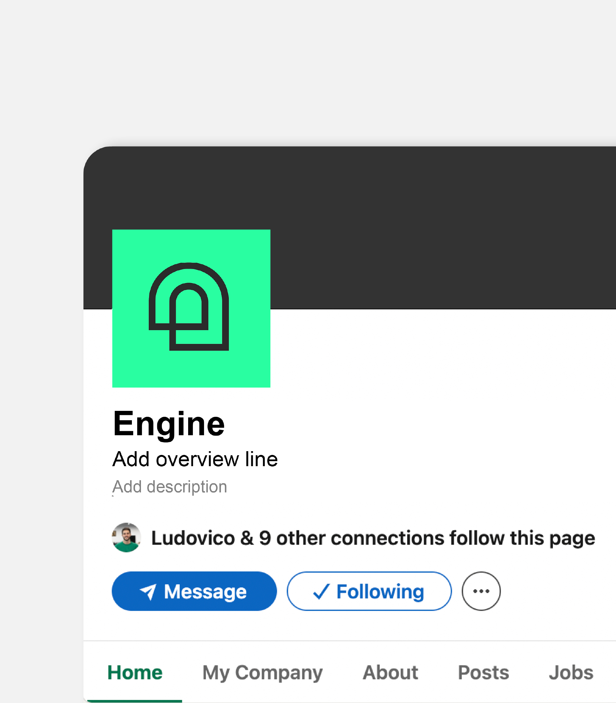
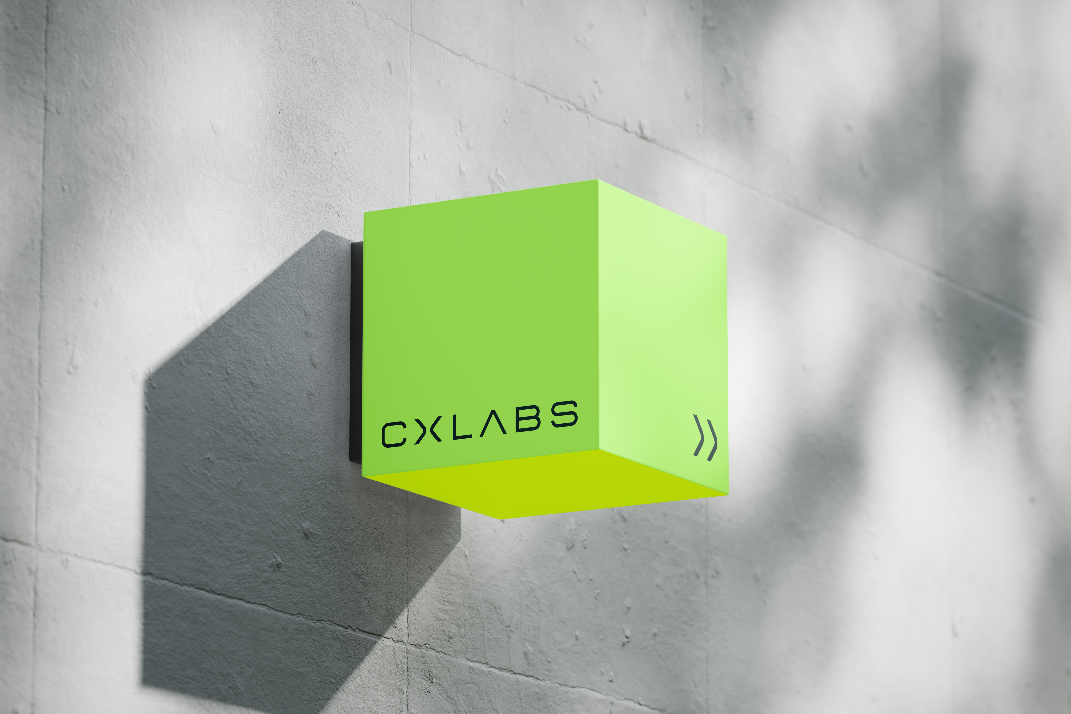
Logo and mark: refined, geometric, and balanced, a symbol of structure and flow.
Typography: Power Grotesk and Euphemia, a pairing that blends confidence with accessibility.
Colour system: clean neutrals punctuated by vibrant green, energy for innovation, calm for credibility.
Imagery: soft, natural, and human, steering clear of the sterile or synthetic to show real people behind real progress.
Iconography: a suite of bespoke product icons, distinct yet cohesive, helping audiences navigate Engine’s ecosystem.
The result is a brand identity that feels sharp, scalable, and unmistakably human.
Application
From pitch decks and presentation templates to web and social design, every touchpoint was built for usability and consistency. Our focus: make it easy for the team to deliver clarity at speed. The guidelines empower anyone within Engine to create confidently, maintaining precision without creative paralysis.
A brand built for scale, powered by people, and grounded in purpose.