Wheelers came to us with a bold idea: To create an experiential brand that redefines what wellness, movement, and community can mean in modern life.
A place that combines physical activity, nourishment, education, and social connection: all under one roof, and all with purpose. Our task was to help bring that vision to life: to turn a philosophy of balance into a lively, authentic brand: part clubhouse, part movement, part mindset.
Partnership
We began with deep immersion: conversations with outdoor communities, hospitality specialists, and lifestyle experts. We explored how people were already trying to live more mindfully, through activities like cycling, running, and exploring — but lacked a true hub to belong to. The insight was simple: people didn’t just want to do more; they wanted to feel more connected while doing it. That became our starting line.
North Star
At the core of Wheelers was a shared belief: a better balance between people and the planet, motion and meaning, nourishment and joy.
The brand’s purpose was clear: to encourage more people of all ages to go outdoors, explore, learn, and reconnect with their environment. Our guiding principle became:
A New Equilibrium: the pursuit of harmony in how we live, move, and belong.
Voice
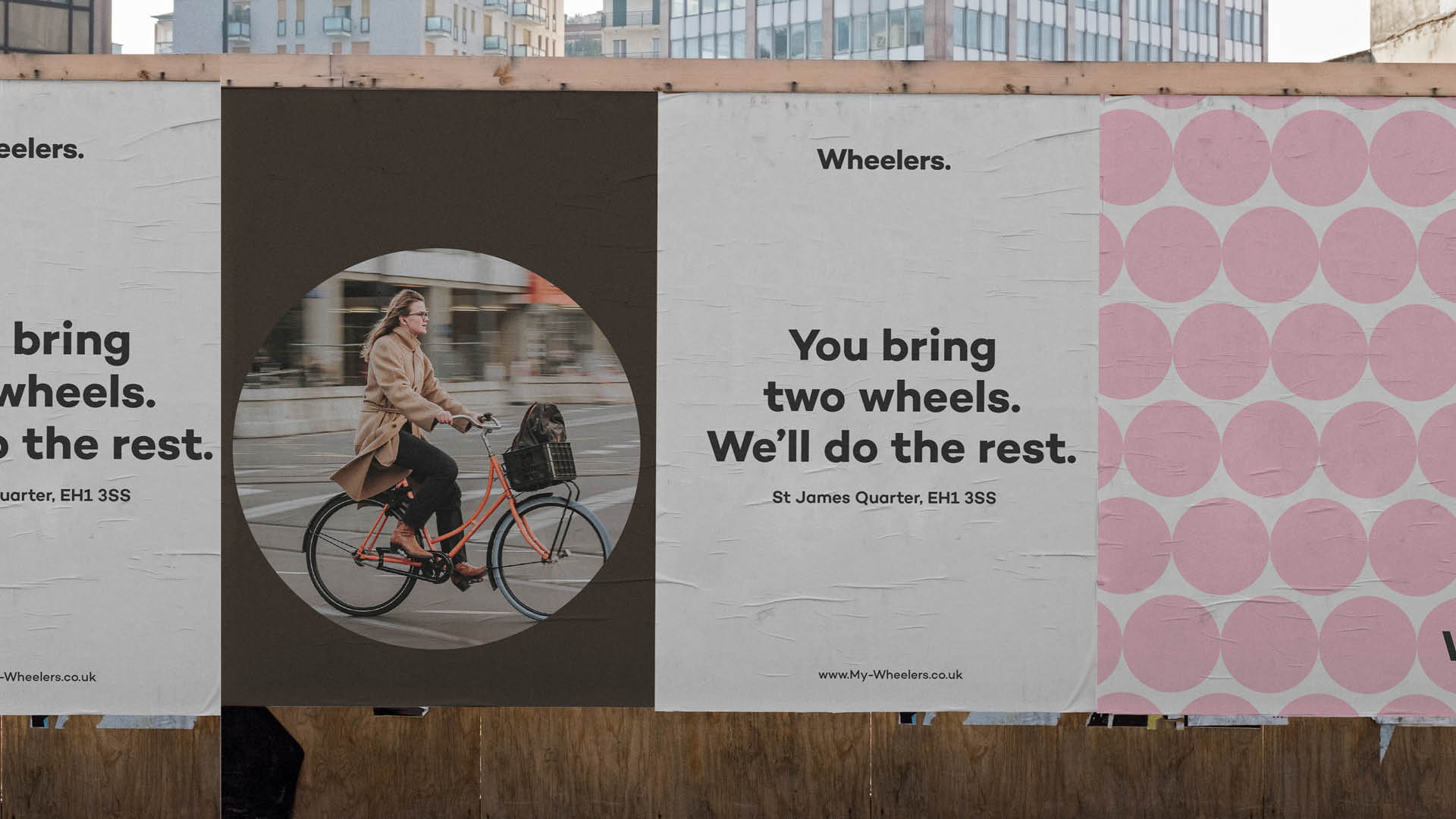
We crafted a tone that conveyed the warmth of community, the optimism of movement, and the quiet confidence of purpose. Human and hopeful, speaking to people, not audiences. Grounded yet inspiring, avoiding wellness clichés in favour of authenticity. Inclusive and curious, never elitist, always inviting.
It’s a voice that encourages action through belonging:
“Join the quiet revolution. Live life outside. Feel better, together.”
The language was designed to feel like a conversation between friends, equal parts motivation and mindfulness.
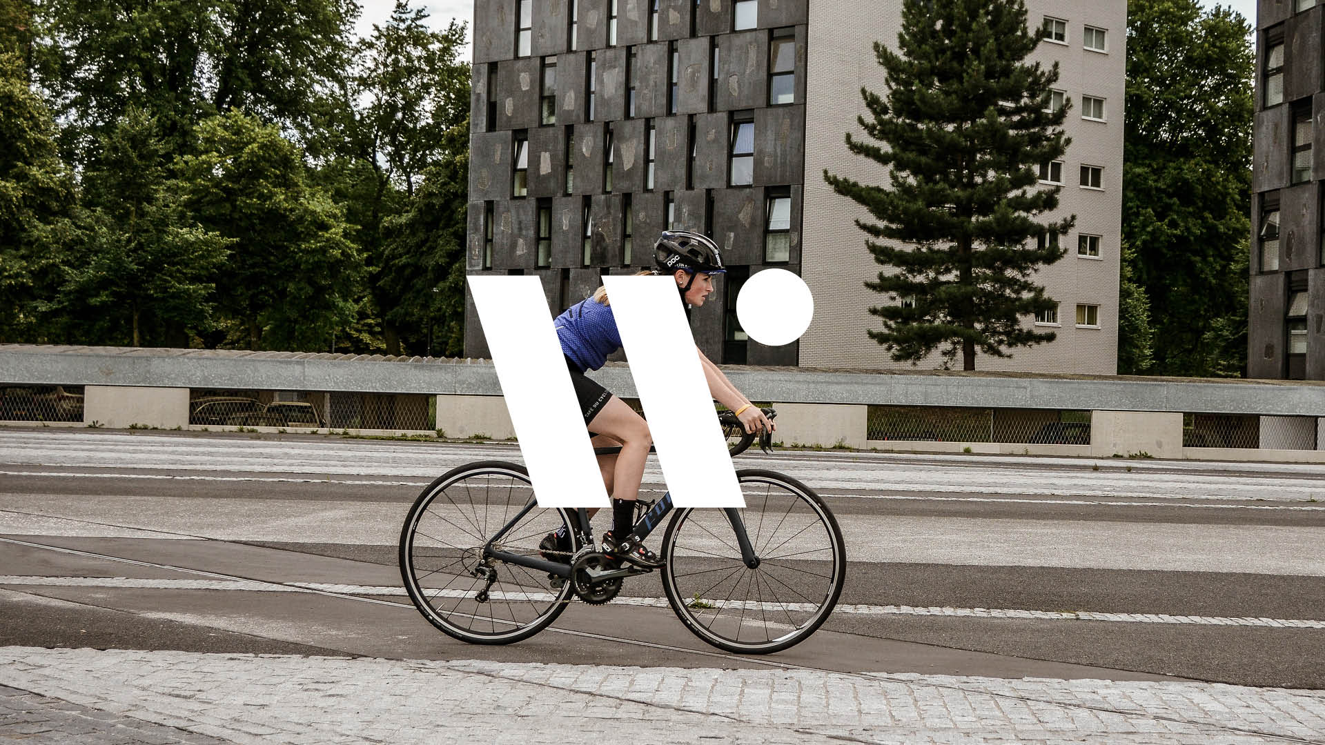
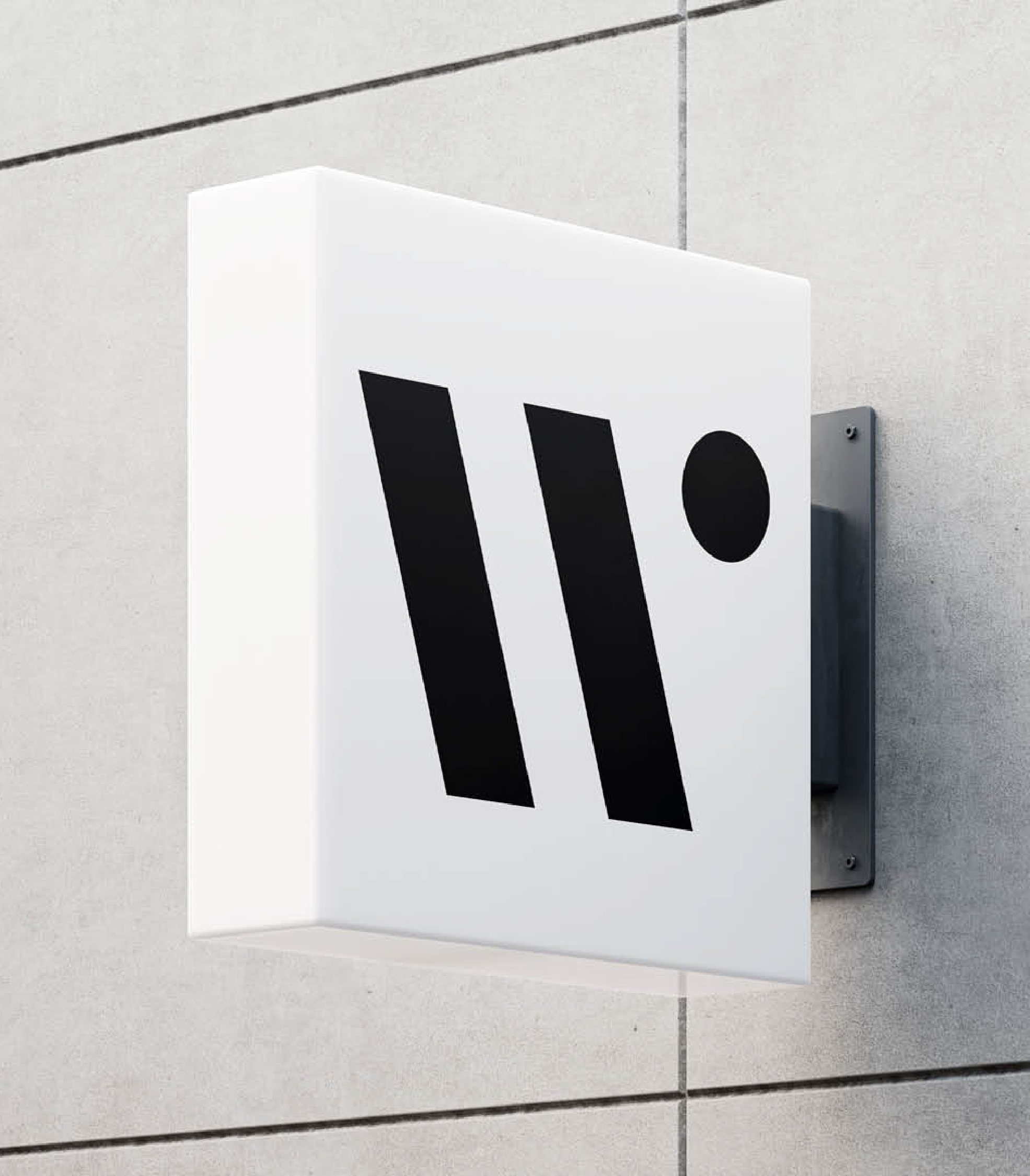
Identity
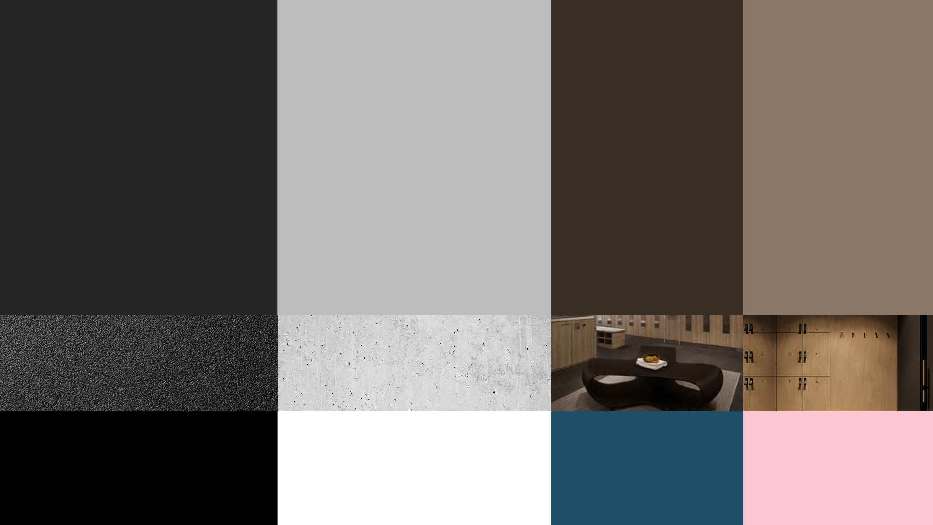
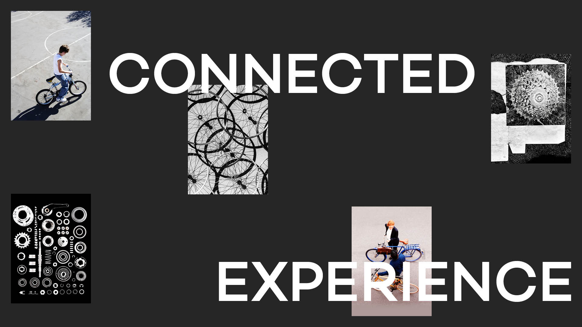
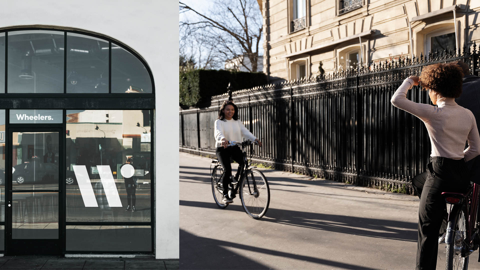
The visual and verbal identity had to balance many worlds: nature and city, calm and energy, movement and stillness. Design System: organic forms meet clean structure, evoking the harmony between built and natural worlds. Typography: warm, modern, and legible, a blend of craft and clarity. Colour palette: earth meets sky, with rooted greens and mineral blues complemented by light neutrals for a calming effect. Finally, imagery: real people in motion, bikes, boots, laughter, shared tables, open skies.
The identity extends beyond aesthetics; it’s an ecosystem designed for adaptability: clubhouses, pop-ups, partnerships, and local experiences all connected under one visual language.
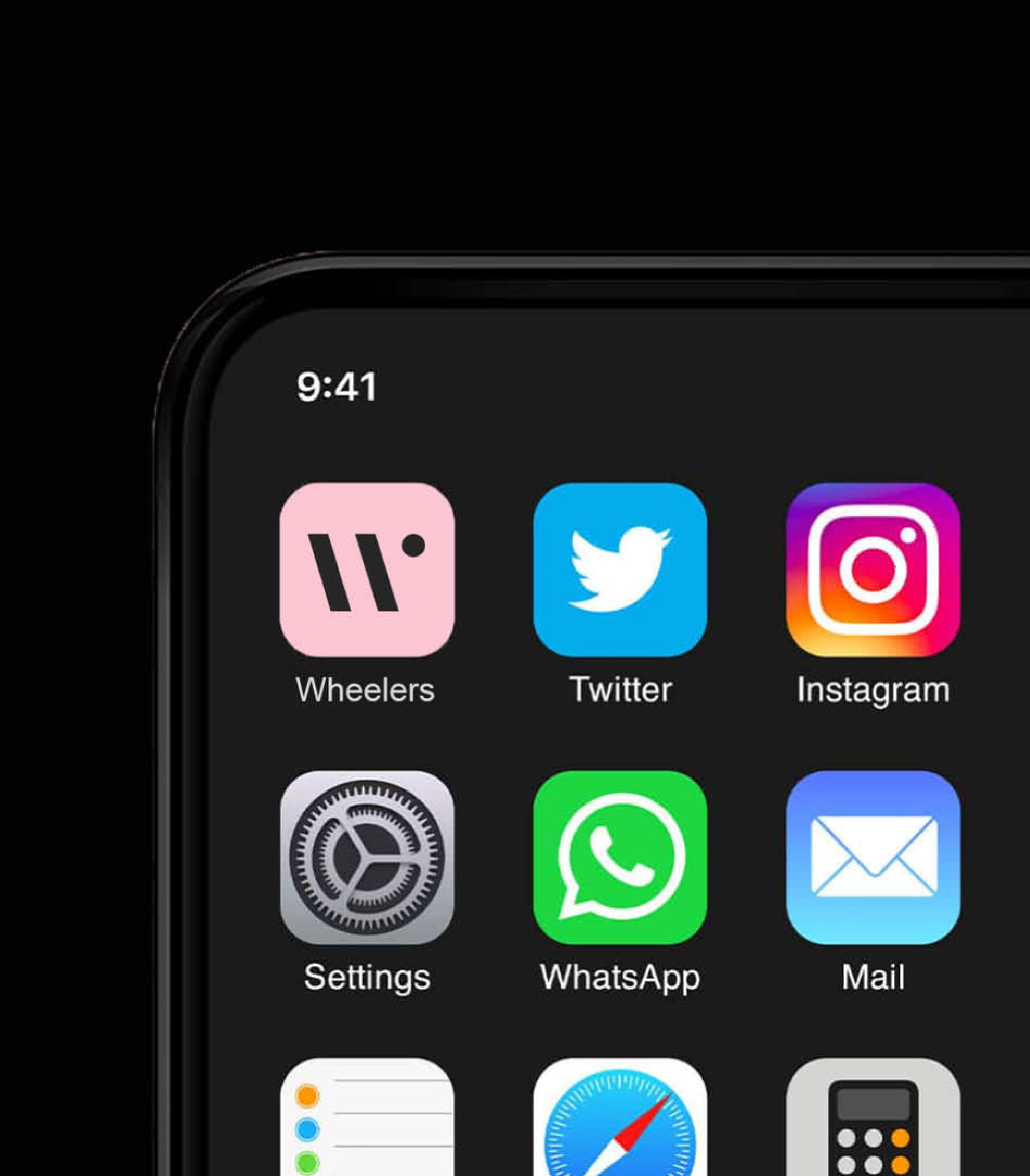
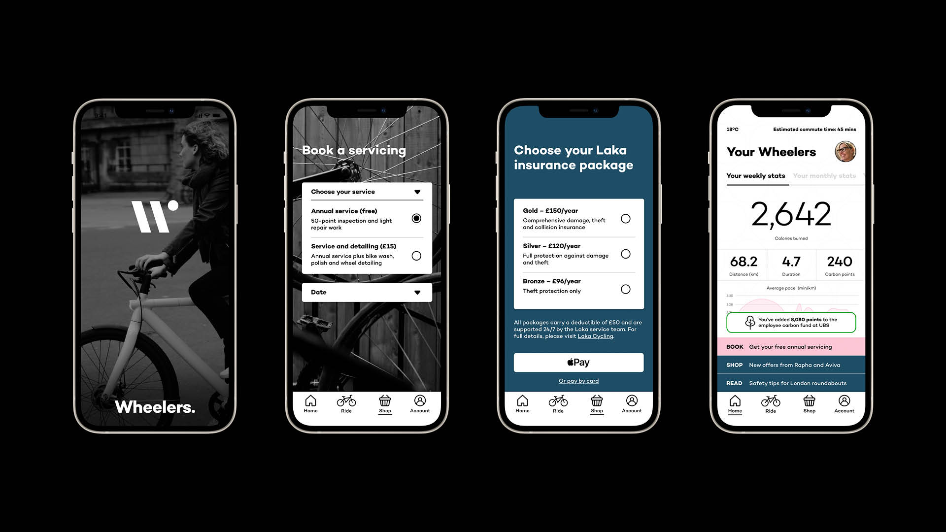
Touchpoints
We designed Wheelers to live as both a place and a mindset, with every touchpoint reinforcing its purpose. Clubhouses as modern community hubs with spaces for food, wellness, learning, and belonging. Digital platforms keep members connected wherever they go. Experiential programmes, such as “Feel Good & Go Places” and “Eat Well & Thrive” are curated journeys that help members move, learn, and live better. Junior Wheelers is the educational point and outdoor adventure for the next generation.
Every experience was tested through the lens of “Does this make life feel richer, simpler and more connected?”
Production
Once the foundations were set, we built a full suite of brand tools: guidelines, tone of voice playbook, membership engagement framework, and storytelling templates for local activation.
Futures
Wheelers is more than a lifestyle concept; it’s a philosophy in motion.
A brand that balances ambition with authenticity, community with individuality, and movement with meaning. It serves as an antidote to isolation, proving that wellness doesn’t have to be solitary and that doing good for yourself can also benefit your world.
Wheelers, where nourishment begins and upcycling never ends.
Blackline Originals — building brave brands for ambitious businesses.